Adding Custom Fields to Web Forms
As of Aeon v5.1, a custom field can be added as an additional input field on any of the relevant web forms once it is configured in the Customization Manager's Custom Field Definitions table. This article contains code templates and configuration examples for custom fields of several different data types to help guide you through this process.
In the code templates below, [ContextType] should be replaced with the Context Type of the custom field (User, Transaction, or Activity) and [ShortName] with the Short Name of the custom field as configured in the Custom Field Definitions table.
For more information about the custom fields feature, see Unlimited Custom Fields.
Adding a Custom Short Text Input Field | Adding a Custom Long Text Input Field | Adding a Dropdown for a CustomDropDown Field | Adding a Checkbox for a Custom Boolean Field | Adding a Custom Date Field
Adding a Custom Short Text Input Field
You can add a short text input for a custom field of the ShortText, LongText, or Integer data type by using the following template:
<div class="form-group col-md-5">
    <label for="CustomFields.[ShortName]">
       <span class="<#ERROR name='ERRORCustomFields.[ShortName]'>">
               [Insert text for field name you want to display here]
       </span>
    </label>
    <input type="text" class="form-control" name="[ContextType].CustomFields.[ShortName]" id="CustomFields.[ShortName]" value="<#PARAM name='[ContextType].CustomFields.[ShortName]'>">
</div>
Tip: You can change the number at the end of the <div> class attribute to adjust the size of the input field:
<div class="form-group col-md-5">
**Click for Example: Adding a "Folder" Field**
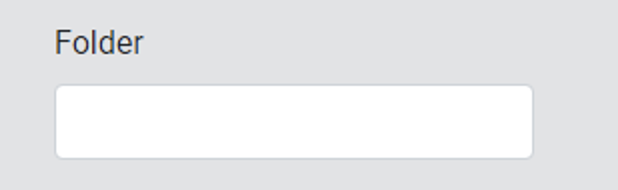
The following code will display a short text "Folder" input field:
<div class="form-group col-md-3">
   <label for="CustomFields.Folder">
      <span class="<#ERROR name='ERRORCustomFields.Folder'>">
              Folder
      </span>
   </label>
   <input type="text" class="form-control" name="Transaction.CustomFields.Folder" id="CustomFields.Folder" value="<#PARAM name='Transaction.CustomFields.Folder'>">
</div>
The configuration for this field in the Customization Manager's Custom Field Definitions table is as follows:
| Field | Value |
|---|---|
| ID | This value is automatically generated. |
| Context Type | Transaction |
| Data Type | ShortText |
| Short Name | Folder |
| Label | Folder |
Adding a Custom Long Text Input Field
You can display a longer text input for a custom field of the LongText data type by using the following template:
<div class="form-group col-md-8">
   <label for="CustomFields.[ShortName]">
      <span class="<#ERROR name='ERRORCustomFields.[ShortName]'>">
              [Insert text for field name you want to display here]
      </span>
   </label>
   <textarea class="form-control" name="[ContextType].CustomFields.[ShortName]" id="CustomFields.[ShortName]" rows="2" cols="40"><#PARAM name='[ContextType].CustomFields.[ShortName]'></textarea>
   <div class="small-notes">[This text displays in small font under the input field]</div>
</div>
**Click for Example: Adding an "Additional Information" Field**
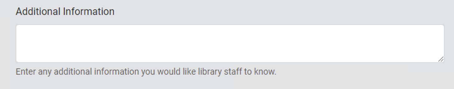
The following code will display a long text "Additional Information" input field:
<div class="form-group col-md-8">
  <label for="CustomFields.AdditionalInfo">
     <span class="<#ERROR name='ERRORCustomFields.AdditionalInfo'>">
             Additional Information
     </span>
  </label>
  <textarea class="form-control" name="User.CustomFields.AdditionalInfo" id="CustomFields.AdditionalInfo" rows="2" cols="40"><#PARAM name='User.CustomFields.AdditionalInfo'></textarea>
  <div class="small-notes">Enter any additional information you would like library staff to know.</div>
</div>
The configuration for this field in the Customization Manager's Custom Field Definitions table is as follows:
| Field | Value |
|---|---|
| ID | This value is automatically generated. |
| Context Type | User |
| Data Type | LongText |
| Short Name | AdditionalInfo |
| Label | Additional Information |
Adding a Dropdown for a CustomDropDown Field
You can add a dropdown for a custom field of the CustomDropDown data type by using the following template:
<div class="form-group col-md-4">
    <label for="CustomFields.[ShortName]">
       <span class="<#ERROR name='ERRORCustomFields.[ShortName]'>">
               [Insert text for field name you want to display here]
       </span>
    </label>
    <select class="custom-select mr-sm-2" name="[ContextType].CustomFields.[ShortName]" id="CustomFields.[ShortName]">
       <#OPTION fieldname="[ShortName]" name="Custom" selectedValue="<#PARAM name='[ContextType].CustomFields.[ShortName]'>" defaultName="[Insert text you want to display by default here]" defaultValue="">
    </select>
</div>
Note: This field must be defined as a field of the CustomDropDown data type in the Customization Manager's Custom Field Definitions table and the Short Name of that custom field must match a Group Name defined with values in the Custom Drop Down table (click the example below for additional guidance).
**Click for Example: Adding a "Research Purpose" Dropdown**
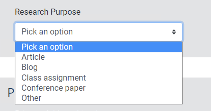
The following code will display a dropdown field that the user can use to select a "Research Purpose":
<div class="form-group col-md-4">
   <label for="CustomFields.ResearchPurpose">
      <span class="<#ERROR name='ERRORCustomFields.ResearchPurpose'>">
              Research Purpose
      </span>
   </label>
   <select class="custom-select mr-sm-2" name="User.CustomFields.ResearchPurpose" id="CustomFields.ResearchPurpose">
   <#OPTION fieldname="ResearchPurpose" name="Custom" selectedValue="<#PARAM name='User.CustomFields.ResearchPurpose'>" defaultName="Choose an option" defaultValue="">
   </select>
</div>
The configuration for this field in the Customization Manager's Custom Field Definitions table is as follows:
| Field | Value |
|---|---|
| ID | This value is automatically generated. |
| Context Type | User |
| Data Type | CustomDropDown |
| Short Name | ResearchPurpose |
| Label | Research Purpose |
The values for this field were entered into the Customization Manager's Custom Drop Down table as follows:
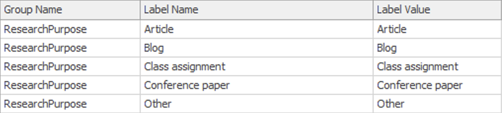
If you would like to add this field, you can configure any specific values you'd like in the CustomDropDown table as long as the Group Name value matches the Short Name in the CustomFieldDefinitions table.
Adding a Checkbox for a Custom Boolean Field
You can add a checkbox input field for a custom field of the Boolean data type by using the following template:
<div class="form-group col-md-5">
   <label for="[ShortName]">
      <span class="<#ERROR name='ERRORCustomFields.[ShortName]'>">
              [Insert text for field name you want to display here]
      </span>
   </label>
   <input type="checkbox" id="[ContextType].CustomFields.[ShortName]" class="checkbox-as-bool" data-bool-fieldname="[ContextType].CustomFields.[ShortName]" <#CHECKED name="[ContextType].CustomFields.[ShortName]">>
</div>
Warning: Do not set a custom Boolean field as required if false/unchecked is an acceptable value for the form.
**Click for Example: Adding a "Sign up for newsletter?" Checkbox**
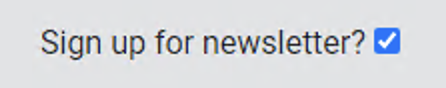
The following code will display a checkbox that users can use to opt-in to receive your newsletter:
<div class="form-group col-md-5">
  <label for="Newsletter">
     <span class="<#ERROR name='ERRORCustomFields.Newsletter'>">
             Sign up for newsletter?
     </span>
   </label>
   <input type="checkbox" id="Newsletter" name="User.CustomFields.Newsletter" class="checkbox-as-bool" data-bool-fieldname="User.CustomFields.Newsletter" <#CHECKED name="User.CustomFields.Newsletter">>
</div>
The configuration for this field in the Customization Manager's Custom Field Definitions table is as follows:
| Field | Value |
|---|---|
| ID | This value is automatically generated. |
| Context Type | User |
| Data Type | Boolean |
| Short Name | Newsletter |
| Label | Send Newsletter? |
Note: The version of the atlasUtility.js JavaScript file included in the Aeon 5.1 Default Web Pages must be present in your web directory and linked to your web form (if the link is not present already) to ensure that the Boolean checkbox field data will pass through correctly when the form is submitted. The atlasUtility.js file is linked to web forms by default through the include_head.html file referenced in the <head> element of the form. For example:
<head><title>Aeon - New User Registration</title><#INCLUDE filename="include_head.html"></head>
If your form has been modified to remove the reference to the include_head.html file, please ensure that the link to atlasUtility.js is added manually within the form's <head> element:
<script src=“js/atlasUtility.js”></script>
Adding a Custom Date Field
The instructions for adding a custom Date field to your web forms will vary based on the version of Aeon that is currently installed. Aeon 5.2 supports a more accessible version of the calendar date picker tool used with custom Date fields on the Aeon web interface. Aeon 5.1 users should either update to Aeon 5.2 to use the new version of this tool or follow the Aeon 5.1 implementation instructions below to implement the previous version of this tool on the Aeon web pages.
This code in this section only applies to custom fields configured to use the Date data type and cannot be used with custom fields configured to use the DateTime data type.
**Click for Aeon 5.1 documentation**
Adding a Custom Date Field
When Aeon 5.1 is installed, you can add a calendar dropdown input field for a custom field of the Date data type by using the following template:
<script>
  $( function() {
    $( "#CustomFields_[ShortName]" ).datepicker();
  } );
</script>

<div class="form-group col-sm-4">
   <label for="CustomFields_[ShortName]">
      <span class="<#ERROR name='ERRORCustomFields.[ShortName]'>">
          [Insert text for field name you want to display here]
      </span>
   </label>
   <div class="input-group">
       <input class="form-control" id="CustomFields_[ShortName]" name="[ContextType].CustomFields.[ShortName]" type="text" aria-describedby="button-datePicker-[shortName]" value="<#PARAM name='[ContextType].CustomFields.[ShortName]'>">
       <div class="input-group-append">
         <button class="btn btn-outline-secondary dateTrigger" type="button" role="button" id="button-datePicker-[shortName]" data-triggerDatePicker="#CustomFields_[ShortName]" aria-label="Calendar">
           <span class="fas fa-calendar ui-datepicker-trigger"></span>
         </button>
       </div>
   </div>

   <div class="small-notes">
       [This text displays in small font under the input field]
   </div>
</div>
Formatting Note
When implementing the calendar dropdown field, any references to the custom field that will be used by the JavaScript should be formatted with underscores instead of periods to avoid issues. For example, the formatting "CustomFields_[ShortName]" should be used in the JavaScript code block, the input id attribute, and the data-triggerDatePicker attribute. All references to the custom field that are used by the Aeon DLL will need to retain the usual "CustomFields.[ShortName]" formatting EXCEPT the label element's for attribute which should use an underscore to match the formatting of the input id attribute.
Example: Adding a "Need By Date" Field
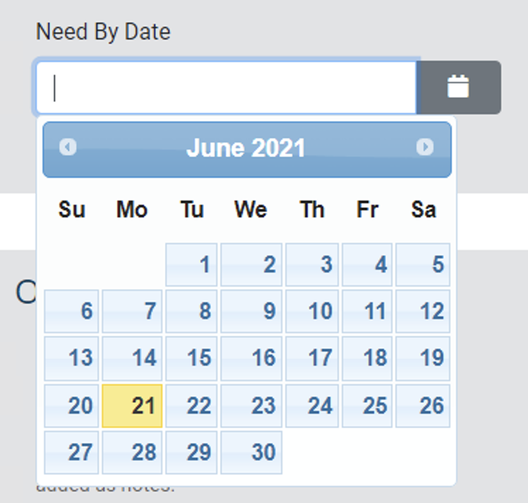
The following code will display a calendar dropdown that users can use to select a "Need By" date for an item:
<script>
  $( function() {
    $( "#CustomFields_NeedBy" ).datepicker();
  } );
</script>

<div class="form-group col-sm-4">
   <label for="CustomFields_NeedBy">
      <span class="<#ERROR name='ERRORCustomFields.NeedBy'>">
          Need By Date
      </span>
   </label>
   <div class="input-group">
       <input class="form-control" id="CustomFields_NeedBy" name="Transaction.CustomFields.NeedBy" type="text" aria-describedby="button-datePicker-needBy" value="<#PARAM name='Transaction.CustomFields.NeedBy'>">
       <div class="input-group-append">
         <button class="btn btn-outline-secondary dateTrigger" type="button" role="button" id="button-datePicker-needBy" data-triggerDatePicker="#CustomFields_NeedBy" aria-label="Calendar">
           <span class="fas fa-calendar ui-datepicker-trigger"></span>
         </button>
       </div>
   </div>

   <div class="small-notes">
       Select the date you need the item.
   </div>
</div>
The configuration for this field in the CustomFieldDefinitions table is as follows:
| Field | Value |
|---|---|
| ID | This value is automatically generated. |
| Context Type | Transaction |
| Data Type | Date |
| Short Name | NeedBy |
| Label | Need By Date |
Aeon 5.2 Instructions
When Aeon 5.2 is installed, you can add a calendar dropdown input field for a custom field of the Date data type by following the steps below:
Required Aeon 5.2 Web Page File Updates
- Implementing the accessible calendar date picker tool for the custom Date field on your web forms using the code below will first require adding several new Aeon 5.2 web page files to your web directory and updating several existing files according to the instructions in the Updating the Date Picker Tool Used for Custom Date Fields on Web Forms (Aeon 5.2 Web Pages) article. Please visit the linked article and follow the instructions to update these files before proceeding with adding the code below.
- This code also requires the updated version of the datepicker.min.js file first released in the Aeon 5.2.11 default web pages. Please ensure that your web directory has been updated with the most recent version of this file before implementing the code changes below.
1. Prerequisite: Updating Scripting on User Forms (If Necessary)
If the custom Date field is to be used on a user web form (NewUserRegistration.html, NewAuthRegistration.html, ChangeUserInformation.html, or ExpiredUsers.html), then two <script> tags will first need to be added to those pages inside the <head> tags used at the top of the following in the following order:
<script type="text/javascript" src="js/lang/en-US.js"></script>
<script type="text/javascript" src="js/datepicker.min.js"></script>
Example (ChangeUserInformation.html):
This example shows how to implement the new <script> tags on ChangeUserInformation.html. Note that the <script> tags must be placed within the <head> and </head> tags at the top of the form:
<head>
    <title>Aeon - Change User Information</title>
    <#INCLUDE filename="include_head.html">
    <script type="text/javascript" src="js/lang/en-US.js"></script>
    <script type="text/javascript" src="js/datepicker.min.js"></script>
</head>
If the custom Date field is used on a web request form such as DefaultRequest.html, then you do not need to add the <script> tags above to the form.
2. Adding the Date Input Field
You can then add a calendar dropdown input field for the custom Date field by using the following template:
<div class="form-group col-sm-4"> <label for="CustomFields_[ShortName]"> <span class="<#ERROR name='ERRORCustomFields.[ShortName]'>"> [Insert text for field name you want to display here] </span> </label> <div class="input-group"> <input class="form-control" id="CustomFields_[ShortName]" name="[ContextType].CustomFields.[ShortName]" type="text" aria-describedby="[ShortName]Notes" value="<#PARAM name='[ContextType].CustomFields.[ShortName]'>"> <div id="[ShortName]_datePickerButton" class="input-group-append btn btn-outline-secondary"></div> </div> <div class="small-notes" id="[ShortName]Notes"> [This text displays in small font under the input field] <span class="sr-only"> A button is available to open a calendar.</span> </div></div>
Formatting Note
When implementing the calendar dropdown field, any references to the custom field that will be used by the JavaScript should be formatted with underscores instead of periods to avoid issues. For example, the formatting "CustomFields_[ShortName]" should be used in the input id attribute and the button id attribute. All references to the custom field that are used by the Aeon DLL will need to retain the usual "CustomFields.[ShortName]" formatting EXCEPT the label element's for attribute which should use an underscore to match the formatting of the input id attribute.
**Click for Example: Adding a "Need By Date" Field**
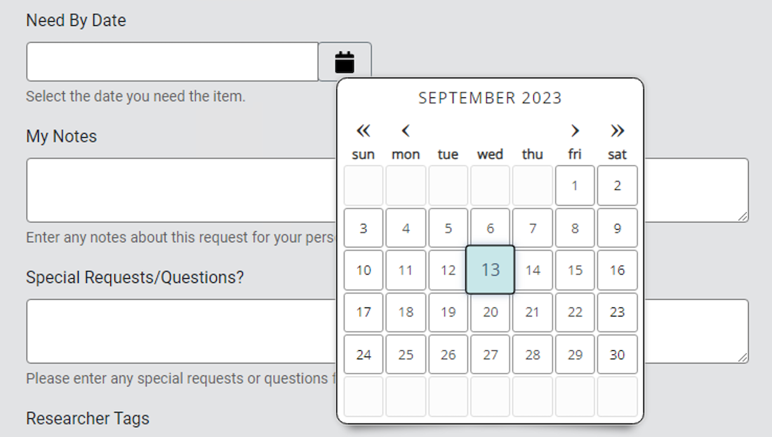
The following code will display a calendar dropdown that users can use to select a "Need By" date for an item:
<div class="form-group col-sm-4">
    <label for="CustomFields_NeedBy">
        <span class="<#ERROR name='ERRORCustomFields.NeedBy'>">
            Need By Date
        </span>
    </label>
    <div class="input-group">
        <input class="form-control" id="CustomFields_NeedBy" name="Transaction.CustomFields.NeedBy" type="text" aria-describedby="NeedByNotes" value="<#PARAM name='Transaction.CustomFields.NeedBy'>">
        <div id="NeedBy_datePickerButton" class="input-group-append btn btn-outline-secondary"></div>
    </div>
    <div class="small-notes" id="NeedByNotes">
        Select the date you need the item. <span class="sr-only"> A button is available to open a calendar.</span>
    </div>
</div>
The configuration for this field in the CustomFieldDefinitions table is as follows:
| Field | Value |
|---|---|
| ID | This value is automatically generated. |
| Context Type | Transaction |
| Data Type | Date |
| Short Name | NeedBy |
| Label | Need By Date |