Getting Familiar with the Staff Web Client Interface
Welcome to the ILLiad Staff Web Client! Whether you're working at your desk, on the go with a tablet, or even checking in quickly from your phone, the interface adapts to give you the best experience on any device. Let's explore how to navigate and make the most of it.
Your First Look at the Interface
When you first log in, you'll notice the Staff Web Client has a clean, modern design with three main areas:
The navigation sidebar on the left is your command center – it's where you'll find all your main workflows like searching, circulation, and processing requests. In the middle, you have your content area where the actual work happens, whether that's viewing request queues or entering circulation data. Finally, up top is your toolbar with quick actions and your user menu.
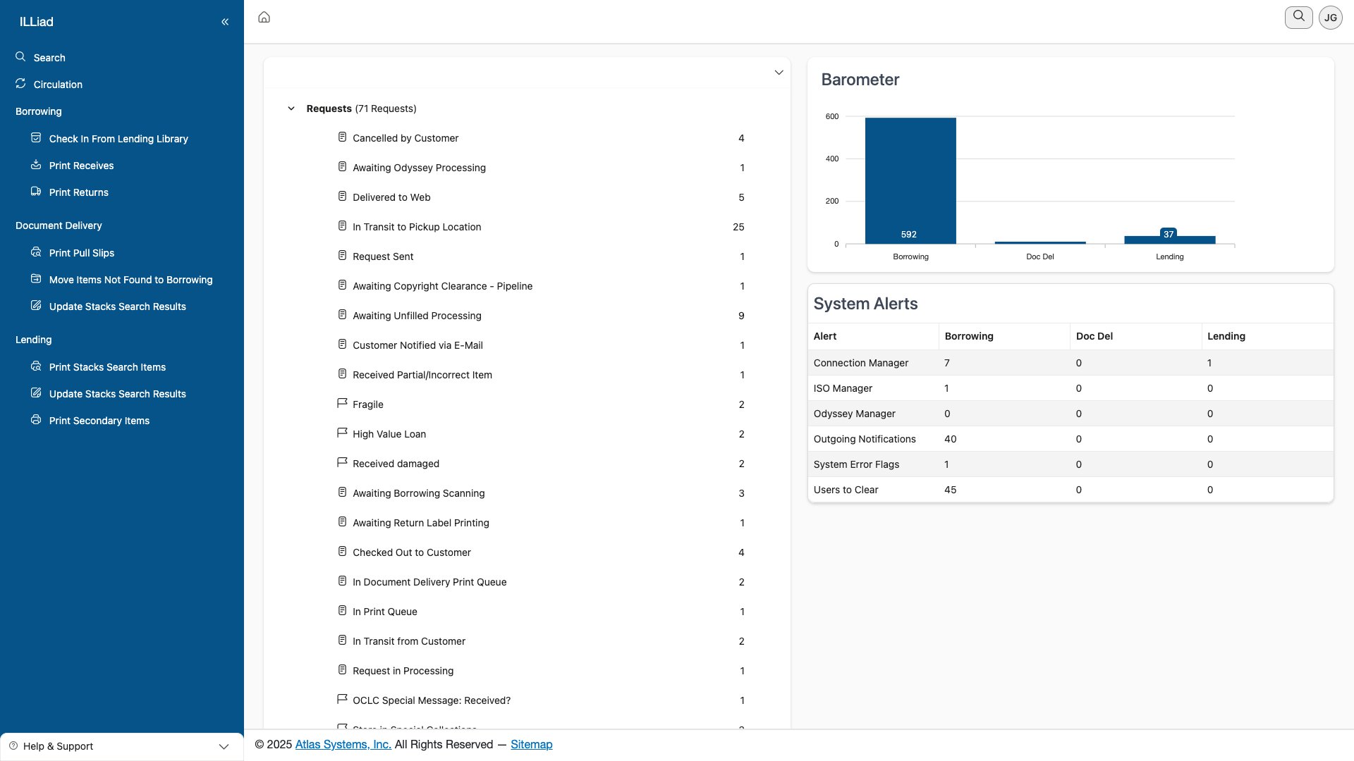 The main dashboard showing the three-panel layout with navigation sidebar, content area displaying queue categories and barometer, and top toolbar
What's really nice is how the interface automatically adjusts to your device. On your desktop, you'll see everything spread out comfortably. Switch to a tablet, and the navigation becomes collapsible to give you more working space. On a phone? Everything stacks vertically and the menu tucks away behind a hamburger icon.
Navigating Around
The navigation sidebar is where you'll spend a lot of time, so let's talk about how it works on different devices.
Working on Desktop
On your desktop computer, the sidebar stays visible by default, showing you all your main workflow areas:
- Search lets you find requests, users, and lenders from anywhere
- Circulation handles all your check-in and check-out needs
- Borrowing is where you process incoming requests
- Document Delivery manages your local delivery workflows
- Lending handles outgoing requests to other libraries
Want more screen space? Just click the double-arrow icon at the top of the sidebar to collapse it down to just icons. You can hover over any icon to see what it does. When you're ready for the full menu again, click that arrow to expand it back out.
Keyboard lovers, press Alt + M to toggle the menu without reaching for your mouse. Then use Tab to move through options and Enter to select.
Using a Tablet
On a tablet, the sidebar automatically collapses to give you more room to work. When you need it, just tap the hamburger menu icon to slide it out. Some tablets even let you swipe from the left edge of the screen to open the menu – pretty handy when your other hand is holding a scanner!
On Your Phone
Working from your phone? The navigation completely hides away until you need it. Tap the hamburger menu and it slides out from the left. Once you pick where you want to go, it automatically closes to maximize your screen space.
The Toolbar: Your Quick Actions Hub
At the top of every page, you'll find the toolbar. It's smart – it shows different buttons depending on what you're doing.
 The staff user menu showing user information and available options
The toolbar always shows you where you are with a breadcrumb trail (you know, like Home > Borrowing > In Processing). On the right, you'll see action buttons that change based on your current task. Working with requests? You might see "New Request" and "Export." In a report? You'll get "Print" and "Refresh" options.
Your user menu lives in the top right corner. Click on your initials to access settings, change sites (if you work with multiple locations), set up printers, or log off.
On smaller screens, look for the three-dot menu – that's where extra toolbar actions hide when there isn't room to show everything.
How Content Adapts to Your Screen
Here's where the web client really shines – everything reshapes itself to work well on your device.
Data Grids That Make Sense
Request lists and search results are smart about how they display. On your desktop, you'll see traditional tables with all columns visible. You can sort by clicking column headers and see action buttons right in each row.
 A responsive grid showing request data with sortable columns and inline actions
Switch to a tablet, and the grid shows just the essential columns. Need to see more? Just swipe on a row to reveal additional options. Touch targets are bigger too, making it easier to tap exactly what you want.
On a phone, forget trying to squeeze a table onto that tiny screen. Instead, each request becomes a card you can tap to expand. Swipe left or right on cards to access quick actions. It's actually quite intuitive once you try it!
Forms That Work Everywhere
Forms are another area where responsive design helps. On desktop, related fields sit side by side – patron info on the left, request details on the right. Complex forms use tabs to organize information logically.
On mobile devices, everything stacks into a single column. Input fields are larger for easier touch entry, and the virtual keyboard won't cover up what you're typing. The system even remembers which keyboard type to show – numeric for barcodes, standard for notes.
Mobile-Specific Goodies
If you're using the web client on a mobile device, you get some special features designed just for touch interfaces.
Touch Gestures That Feel Natural
The web client supports gestures you're already used to:
- Swipe left or right to move between records or reveal action buttons
- Pull down to refresh a list (though most update automatically)
- Long press on items to see more options
- Pinch to zoom when viewing PDFs or images
Barcode Scanning Made Easy
The circulation module really shines on mobile devices. When you tap into a barcode field, your device is ready to scan – either with the built-in camera or a connected Bluetooth scanner.
Once you scan, the field automatically submits (no need to hit Enter), and you'll hear a confirmation beep. If something goes wrong, you'll hear a different sound and see an error message.
Turn your device sideways when scanning – landscape mode gives you a wider view and makes it easier to capture those long barcodes.
Working Offline (Sort Of)
Lost your connection? Don't panic. The web client shows a red banner at the top to let you know, but you can still view any data that's already loaded.
Any actions you try to take get queued up and will process automatically once you're back online. The system keeps trying every few seconds, so you don't have to do anything – just wait for that green "Connected" message.
Making It Your Own
Everyone works differently, and the web client remembers how you like things set up.
Display Options
Click on your user menu to find display preferences. You can adjust:
- Theme – Some installations offer dark mode for those late-night shifts
- Density – Choose between comfortable spacing or a compact view to see more at once
- Font Size – Make text larger if you need it
Your Layout, Remembered
The best part? The system remembers your preferences separately for each device type. Your desktop might show ten columns in the request grid while your phone shows just the essentials. Collapse a section on your tablet, and it stays collapsed next time you log in on a tablet (but not on your desktop).
It remembers:
- How wide you made each column
- Which columns you reordered
- What you had expanded or collapsed
- Your last sort preferences
- Even which tab you were on in multi-tab interfaces
Accessibility Built In
The web client was designed from the ground up to be accessible to everyone.
Keyboard Navigation
Every single feature works with just a keyboard:
- Tab moves you forward through elements
- Shift+Tab goes backward
- Arrow keys navigate within menus and grids
- Space or Enter activates buttons
- Escape closes pop-ups and menus
Screen Reader Friendly
If you use a screen reader, you'll find the web client speaks your language. Every button, link, and control has proper labels. Complex interfaces include instructions that only screen readers announce. Skip links let you jump past repetitive navigation.
Visual Accommodations
The interface supports high contrast mode and maintains good color contrast throughout. You can zoom up to 200% without horizontal scrolling (the layout just adapts). Focus indicators are clear and consistent, and status indicators don't rely solely on color.
Tips for Best Performance
On Desktop
- Use keyboard shortcuts to work faster
- Open multiple browser tabs for different workflows
- Customize your grid layouts once and enjoy them forever
On Mobile
- Close browser tabs you're not using to free up memory
- Use "Add to Home Screen" for an app-like experience
- Let auto-rotate do its thing – some tasks are easier in landscape
- Clear your browser cache if things seem sluggish
While the web client is generally lighter on data than the Windows client, printing large reports or batch documents can still use significant bandwidth on cellular connections.
When Things Go Wrong
Technology isn't perfect, but most issues have simple fixes.
Interface not responding? Try refreshing with Ctrl+F5 (Cmd+R on Mac), clear your browser cache, or check your internet connection.
Layout looks weird? Make sure you're using a supported browser (Chrome, Edge, Firefox, or Safari), disable browser extensions that might interfere, and check that your zoom is at 100%.
Touch not working right? Clean your screen (seriously, it helps!), remove any thick screen protectors, and check your browser's touch settings.
Ready for More?
Now that you're comfortable with the interface, here's what to explore next:
- Login Methods – Set up the authentication that works best for you
- Keyboard Shortcuts – Speed up your workflow
- Search Functionality – Become a search power user
| Previous | Current | Next |
|---|---|---|
| Overview | Getting Familiar with the Interface | Login Methods |