Print Designer: Callslip
A callslip is the paper slip staff print and carry into the stacks to pull a requested item. The Print Designer is where you decide what that slip looks like: which fields print (call number, item title, location, the researcher's name), where they sit on the page, what's in bold, whether a barcode appears, and how many slips fit on a sheet. Aeon includes a default callslip, so you don't have to touch this — most sites start from the default and tweak it once.
You design the callslip here; staff actually print it later from a request (or a batch of requests) using the Print Callslip action. This page covers the design side — see Printing Callslips for the printing workflow.
- Your callslips are missing a field you need in the stacks (a sub-location, a reference number, a custom field) — add it here.
- You want callslips to print two- or four-up to save paper — set the records-per-page grid.
- You want a barcode on the slip so retrieved items can be scanned back in.
- You're moving from the Aeon 6 Word mail-merge templates and want to rebuild the slip visually instead of fighting merge fields.
The callslip designer is one mode of Aeon's print designer. The Request, User, Invoice, Invoice Statement, and Digitization Request templates all use the same canvas and tools — only the available fields and the sample preview data differ. If you've designed a request slip, a callslip works identically.
Opening the callslip designer
- Open the Customization Manager.
- In the left navigation, under Designers, choose Print Designer. It opens on the Request template.
- Print Designer expands into one entry per template type — Request, Callslip, User, Invoice, Invoice Statement, and Digitization Request. Choose Callslip.
The browser tab reads Print Designer: Callslip while you're editing callslips.
Creating, renaming, duplicating, deleting, importing, exporting, or saving a template requires the Designers configuration capability. Without it you can still reach the page and look at templates, but the save and template-management actions are blocked. Generating a Preview requires either the Designers capability or View access to Requests. See Roles & Capabilities.
The designer needs room to work. On a phone-sized screen it shows "Larger Display Required" and asks you to switch to a tablet or desktop. Plan to design templates at a desk, not on a handheld.
How the designer is laid out
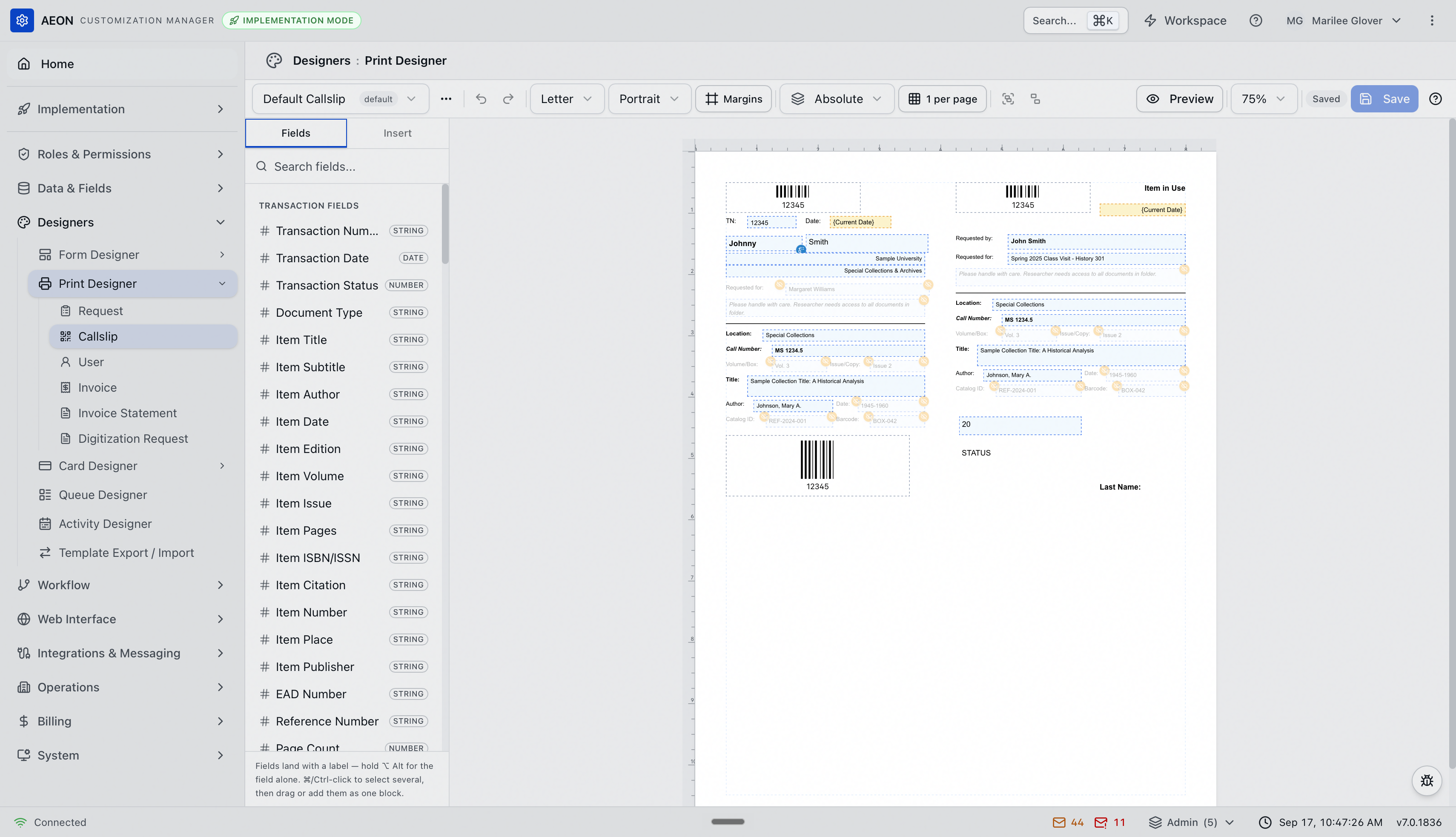
With a template open you have a toolbar across the top, a panel on the left, and the page canvas filling the rest:
| Area | What it's for |
|---|---|
| Toolbar (top) | The template selector and its ⋯ menu, undo/redo, page size, orientation, Margins, the layout mode, records-per-page, group/ungroup, Preview, zoom, the save controls, and a ? button that opens the keyboard-shortcut list. |
| Left panel | Two tabs — Fields and Insert — for adding content to the page (see below). |
| Canvas (center) | The slip itself, drawn to scale with rulers. You arrange everything here by dragging. |
You edit a piece of the slip by selecting it — a small floating toolbar appears just above the selection with that element's settings (its field, format, styling, visibility conditions, and exact position). Nothing you place is permanent until you save.
The save indicator on the toolbar always tells you where you stand: Saved, Unsaved, or Saving....
Adding content: the Fields and Insert tabs
Everything on the slip is an element. The left panel gives you two ways to add one.
The Fields tab
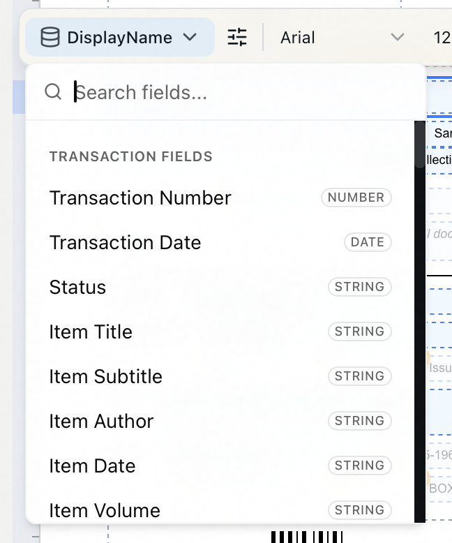
The Fields tab is a searchable list of the data you can print, grouped by category in this order: Transaction Fields (transaction number, item title, call number, location, sub-location, and so on), User Fields, Address Fields, Secondary Address, User Status Fields, Research Fields, Researcher Fields, Activity Fields, Appointment Fields, Notes, Staff Fields, and Institution Fields — plus a Custom Fields group at the end if you've defined any transaction custom fields. Each field carries a small badge for its data type (for example STRING, NUMBER, or DATE). Type in the Search fields... box to filter.
A callslip draws on exactly the same field set as the request slip, since both print from a transaction.
- Click a field to drop it on the page. It lands as a labeled row — the field's label next to its value (for example, Call Number: followed by the call number).
- Hold
⌥ Altwhile clicking to drop the value alone, with no label. - Drag a field onto the canvas to place it exactly where you want.
- To add several at once,
⌘/Ctrl-click each field, then drag them on or use Add to page — they stack as one block in the order you picked them.
The panel reminds you of this at the bottom: "Fields land with a label — hold ⌥ Alt for the field alone. ⌘/Ctrl-click to select several, then drag or add them as one block."
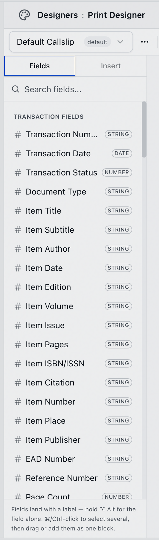
Common callslip fields: Call Number, Location, Sub-Location, Item Title, Item Author, Item Volume, Transaction Number, and the researcher's name. On the canvas these show realistic sample values (call number MS 1234.5, request 12345, item "Sample Collection Title: A Historical Analysis") so you can judge spacing before printing.
The Insert tab
The Insert tab holds the building blocks that aren't tied to a single field:
| Element | What it puts on the slip |
|---|---|
| Text | A static label that prints exactly as typed — e.g. "CALLSLIP" or "Pull for:" |
| Field | A single data value, unbound at first — you choose which field after placing it. |
| Barcode | A scannable barcode generated from a field value, by default the transaction number. |
| Line | A horizontal rule for separating sections. |
| Vertical Line | A vertical rule — for a column divider or a fold line. |
| Rectangle | A box or border. |
| Image | A picture from the image gallery — usually your institution's logo. |
Below those, an Auto Fields group prints values about the printout itself rather than the request: Page Number, Page Count, Current Date, and Printed By.
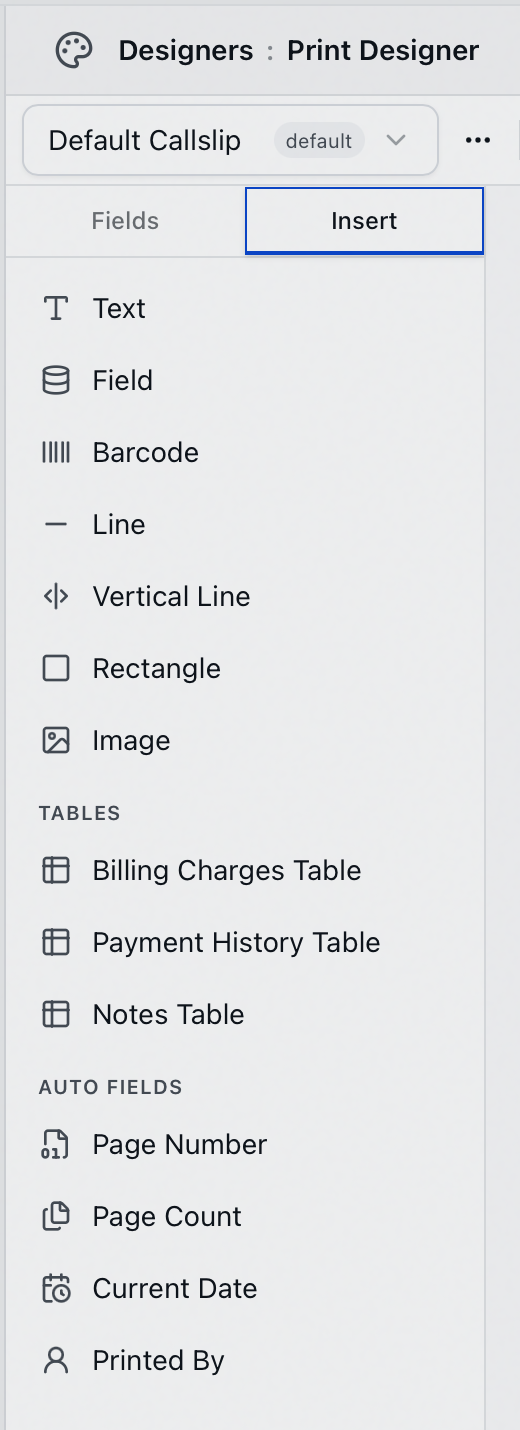
A Tables group offers three repeating tables — Billing Charges Table, Payment History Table, and Notes Table. The two billing tables suit invoices and statements rather than a callslip, which covers a single request. Notes Table is the useful one here: it prints every note on the request, oldest first, in three columns — Date, Note, and Added By.
Editing an element
Select an element and its floating toolbar appears above it. What the toolbar offers depends on the element:
-
A field shows its field button (the bound field's name, with a chevron), a Format button, and text-styling controls — font family and size, bold, italic, underline, alignment, and text color. Click the field button to open a searchable field picker and choose a different field; or double-click the field on the canvas to jump straight into that picker. Beside Format sits the fallback field button: pick a second field to print when the bound one is empty — the visual equivalent of a Word
{ IF A "" B }cascade, say Preferred Name falling back to First Name. A field with a fallback carries a small blue badge on the canvas; click it to change the fallback.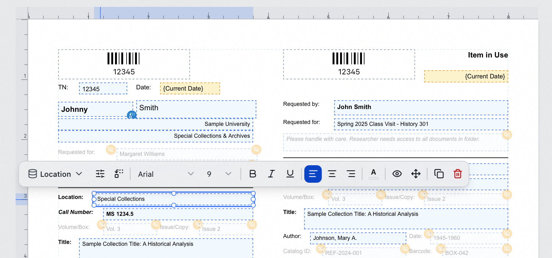
-
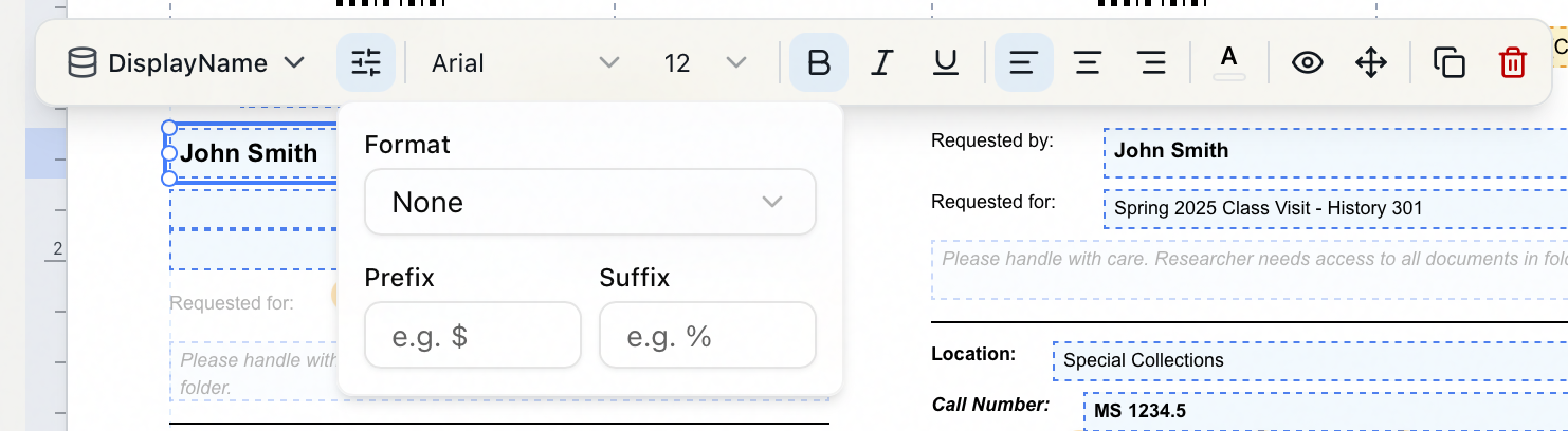
Format (the sliders button) opens a small popover: a Format menu — None, Currency, Number, Short Date, Long Date, or Date & Time — plus Prefix and Suffix boxes, hinted with "e.g. $" and "e.g. %". Picking a field also applies a default format for its data type.
-
Text offers typography controls; double-click a text element to edit its words in place.
-
Line and Rectangle offer shape styling — a Stroke color swatch (the popover also sets Stroke width) and a Stroke style menu of Solid, Dashed, or Dotted. A rectangle adds Fill & corners for its Fill color and Corner radius.
-
Image and Barcode offer their own source/appearance controls.
-
Visibility conditions (the eye button) controls when the element prints — see Hiding a field when it's empty.
-
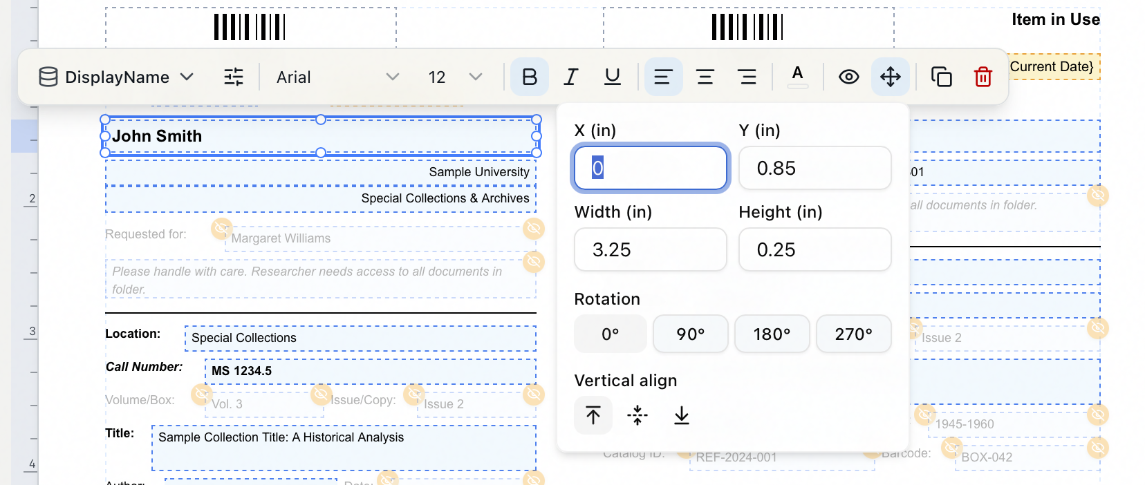
Position & size (the four-arrows button) places the element precisely: X and Y, Width and Height — all in inches. On text, field and auto-field elements it also offers Rotation presets of 0°, 90°, 180°, and 270° and vertical-alignment buttons; shapes, images, barcodes and tables show the four measurements only.
-
Duplicate (
⌘D) and Delete (⌫) finish the toolbar.
Arranging and fine-tuning
- Move an element by dragging it; resize it with its handles.
- Nudge a selection with the arrow keys — hold Shift for a larger step.
- Select several with Shift-click (or
⌘/Ctrl-click); a floating align/distribute toolbar appears, and you can Group them (⌘G) so they move as one. Ungroup with⌘⇧G. - Standard editing shortcuts work on the canvas: copy (
⌘C), paste (⌘V), duplicate (⌘D), delete (Delete/Backspace), select all (⌘A), and undo / redo (⌘Zand⌘⇧Z). - To move around without the mouse:
Tabcycles through the elements on the page (⇧Tabreverses),F6cycles between the panel and the canvas, andEscapeclears the selection.
Press ? anywhere in the designer for the full shortcut list on screen.
Page setup
The toolbar shapes the physical page:
- Page size — Letter, Legal, A4, or A5, plus any sizes your site has defined. Custom... opens a dialog for a one-off Width and Height in inches or millimeters; Manage page sizes... is where the site-wide list is maintained.
- Orientation — Portrait or Landscape.
- Margins — opens Page Margins (in) with Top, Right, Bottom and Left boxes, from 0 to 3 inches in steps of 0.125. Set them and click Apply.
- Layout mode — Absolute or Flow. Absolute is the fixed canvas described on this page, and callslips normally stay there. Flow turns the template into stacked bands that grow with their content — see Print Designer: Flow Layout.
- Records per page — the grid button (it reads, for example, 1 per page). For one slip per page, leave it at 1. To print compact slips several to a sheet, open it and set Rows and Columns (with optional Row Gap / Column Gap in inches), then click Apply. Aeon shows the resulting Cell size and how many Records per page that makes. This is the modern equivalent of a multi-up label sheet. The grid applies in Absolute mode; in Flow mode the toolbar replaces it with a record separation control.
Hiding a field when it's empty (conditions)
Not every request fills every field. Rather than printing a stray "Volume:" label with nothing after it, hide the element when its data is blank. The designer handles this with each element's visibility control (the eye button on its floating toolbar).
-
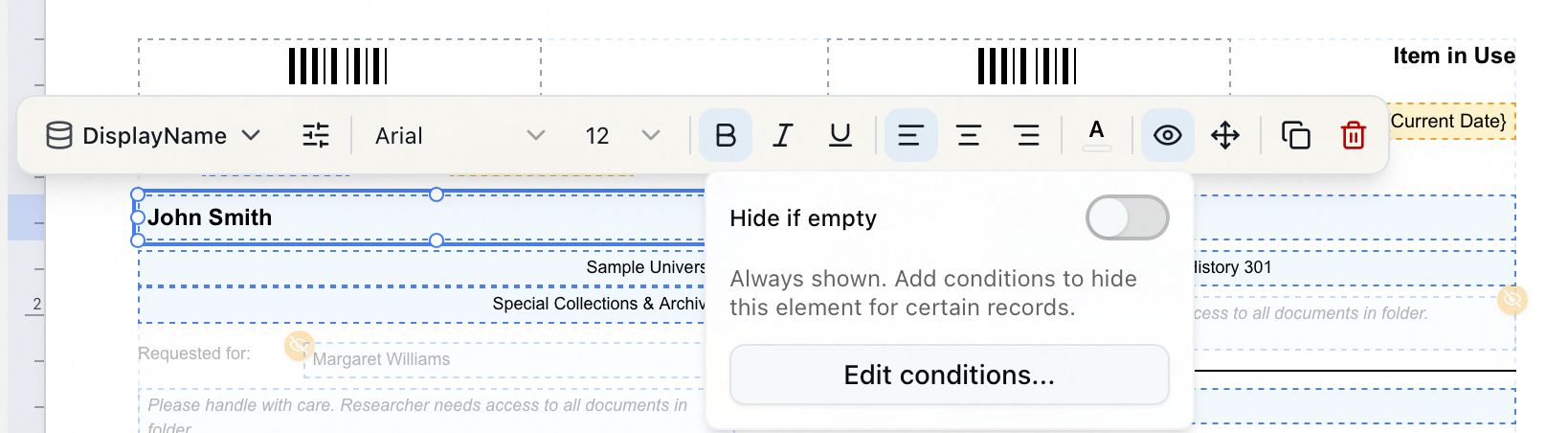
Select the element and open its Visibility conditions popover (the eye button). With nothing set it reads "Always shown. Add conditions to hide this element for certain records."
-
For the simplest case, turn on Hide if empty — the element drops off any slip where that field has no value.
-
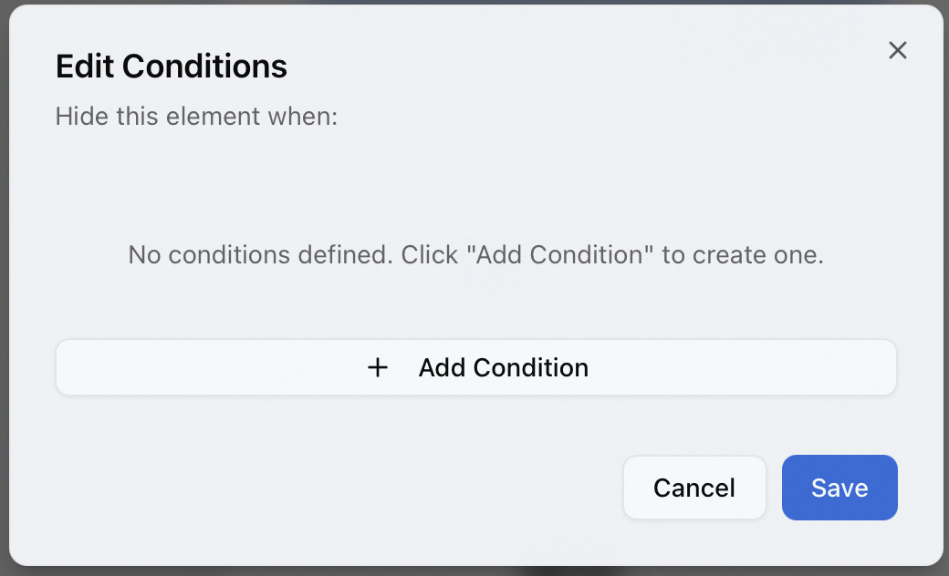
For anything more involved, click Edit conditions... to open the Edit Conditions dialog, headed "Hide this element when:". Until you add one it says "No conditions defined. Click "Add Condition" to create one." Click Add Condition, choose a field and an operator — is empty, is not empty, equals, does not equal, contains, is greater than, or is less than — and a value where one's needed, then Save. With more than one condition, the element hides when any of them match.
Any element carrying a condition gets a small amber badge with a crossed-out-eye icon in its top-right corner, so you can see at a glance which parts of the slip are conditional. Hover the badge and it tells you how many conditions the element has — or "Hidden: Conditions not met" when the element is one the current sample data would drop.
If you're recreating an Aeon 6 template, this is where the hidden Word IF field codes are rebuilt — visually, instead of in toggled field codes.
Select a group and its floating toolbar has its own visibility control, so an entire block — an optional volume/issue line, say — shows or hides as a unit.
Previewing before you commit
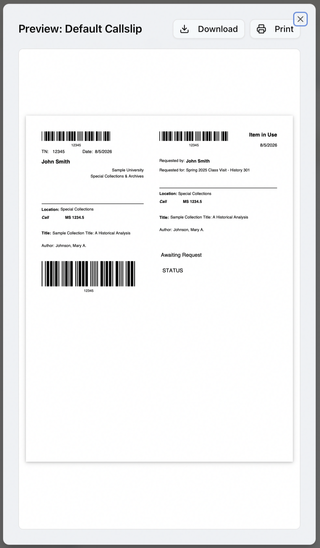
Click Preview in the toolbar at any time. Aeon renders the current template to a PDF using sample data — a representative transaction number, title, call number, and dates — and opens it in a dialog headed Preview: followed by the template's name (for example Preview: Default Callslip), so you see the slip laid out as it will print. From there you can Download the sample PDF or send it to your Print dialog. Preview reflects the canvas as it stands, including edits you haven't saved yet.
Saving and managing templates
- Save with the toolbar's Save button or
⌘S; the indicator switches to Saved. - Discard changes with the discard button that appears next to the save indicator while you have unsaved edits — it reverts to the last saved version.
The designer tracks unsaved changes per template. Save before you switch to a different callslip, move to another template type, or import — selecting another template loads its saved state and your in-progress edits are not kept.
A callslip is stored as a template, and the designer keeps as many as you like (one for the reading room and one for offsite retrieval, say). The template selector on the left of the toolbar switches between them — the one marked default is highlighted — and its ⋯ menu manages them:
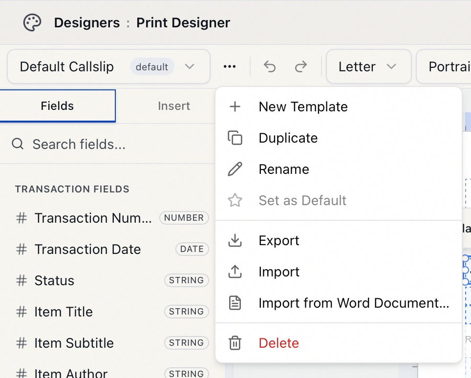
- New Template — start a fresh callslip.
- Duplicate — copy the current one as a starting point (you name the copy, pre-filled as "… (Copy)").
- Rename — give it a meaningful name.
- Set as Default — mark which callslip Aeon reaches for first. Only one template per type is the default; setting a new one clears the old.
- Export / Import — download the template (with its images) as an
.aeon-print-template.zippackage, or load one back in — handy for moving a layout between sites or environments. - Import from Word Document… — bring a Word template in (see below).
- Delete — remove the template.
Bringing a Word template across
Coming from the Aeon 6 desktop client, you don't have to rebuild your callslip by hand.
- Open the template ⋯ menu and choose Import from Word Document….
- Pick your existing
.docor.docxfile. - Aeon parses it, converts the merge fields it recognizes into designer fields, pulls in images, and creates a new callslip template — then shows an Import Summary of what came across.
- Importing creates a new template and switches to it. If you have unsaved edits, Aeon warns you first — they'll be lost, so save before importing.
- Unmapped fields: merge fields Aeon can't match to a known field come in unmapped and carry a warning badge on the canvas. Select each and choose the right field from its picker.
- Conditional
IFfields are not converted. Rebuild that logic with element conditions. - Always Preview an imported template before making it the default — spacing usually needs a touch-up.
How the callslip you design gets used
When a staff member opens a request and clicks Print Callslip in the request toolbar, Aeon opens a print dialog showing a live PDF of the slip. If you keep more than one callslip template the dialog shows a template picker; with only one there's nothing to choose. When the picker appears, Aeon pre-selects, in order: the template that staff member last used, then the one you marked default, then the first available. So the callslip you design here — especially the default — is what your team prints day to day.
Printing — or downloading with routing — writes a "Callslip Printed" entry to the request's history. The toolbar also offers a separate Print Callslip button while the request sits in a queue that can still route to In Item Retrieval — typically Awaiting Request Processing or Awaiting Activity Processing. Using it, the dialog adds a Download & Route to In Item Retrieval button beside the plain Download, and the Print button becomes Print & Route to In Item Retrieval; either routing button moves the request to In Item Retrieval, while plain Download saves the PDF and changes nothing. Reprint Callslip sits in the toolbar's Print menu at every stage and reprints the slip without changing status. That workflow behavior lives with the request toolbar rather than the designer — see Printing Callslips.