Form Designer: Request Form
The request detail page is where staff do most of their work: it shows a request's status, the item being requested, location and call number, service options, and your site's custom fields. The Form Designer is how you decide what that page looks like — which fields appear, how they're grouped, what order they fall in, and whether each field is editable, read-only, or shown as formatted text.
You won't open the Form Designer every day — you reach for it when a request field needs to move, a custom field needs to appear, or a role needs its own view. The work is visual and direct: the designer shows a live canvas of the request page, and you edit that page in place — click an element to select it, drag it to move it, drag its edge to resize it, and set its properties from a small toolbar that appears above it. What you build is stored as a layout template, and templates can be assigned to different staff roles — so front-desk staff and processing staff each see a layout tuned to their job. (In the Windows client this same layout work meant editing customization keys and form definitions by hand.)
- You want to add one of your site's custom fields to the request page so staff can see and edit it.
- A field is in the wrong place, or a whole card should be reordered, renamed, or removed.
- Different roles need different views of a request — build a template per role and assign it (see Editing a Role: Layout Assignments).
- You're setting up a new site and want the default request layout to match your workflow.
The Form Designer lives in the Customization Manager and requires the Designers configuration capability. If your role doesn't have it, the Designers group won't appear in the Customization Manager menu, and the underlying layout-template API rejects the request. This is an admin/customizer tool, not a per-staff preference. See Roles & Capabilities.
Getting there
- Open the Customization Manager.
- In the left menu, expand the Designers category.
- Click Form Designer.
Form Designer opens on the Request form by default. The same tool also edits the User and Activity forms — see Form Designer: User Form and Form Designer: Activity Form. This page covers the request form specifically, but the editor works identically for all three.
The designer needs room to show the palette and the canvas side by side. On a phone-sized screen Aeon shows "Larger Display Required" instead of the editor — use a tablet or desktop.
The workspace
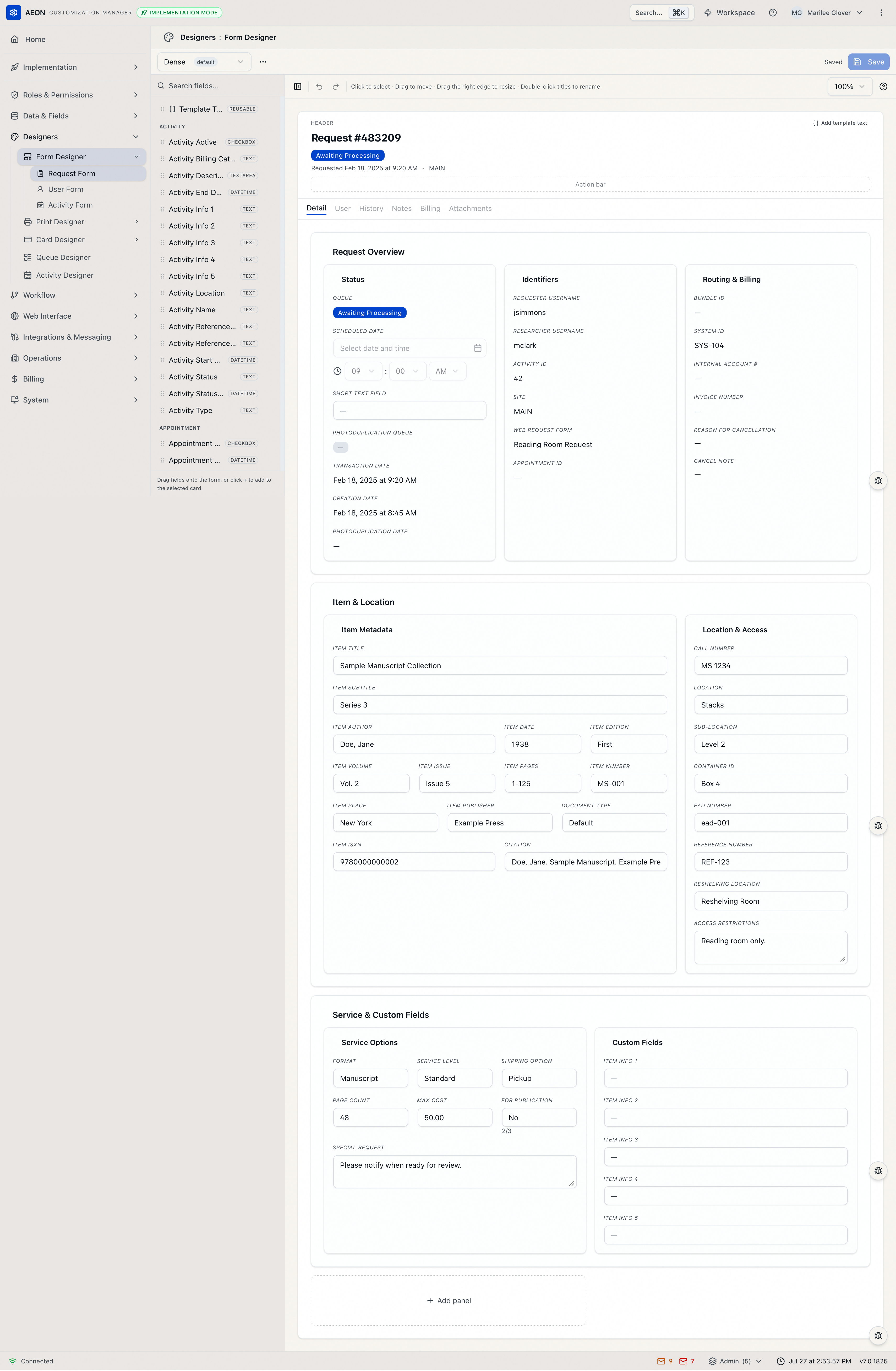
The Form Designer has a toolbar across the top and two working areas below it — a field palette on the left and the canvas in the center.
Across the top you'll find:
- The template selector (left) — the layout you're editing, with the current default template tagged default. Next to it, the ⋯ menu holds template management (see Working with templates).
- A save-state indicator — Saved, Unsaved, or Saving... — and the Save button. A discard (circular-arrow) button appears next to it whenever you have unsaved changes.
- A button to show or hide the field palette, so you can give the canvas the full width while you work.
- Undo and redo arrows (
Ctrl+Z/⌘ZandShift+Ctrl+Z/⇧⌘Z). - A Zoom control (50% / 75% / 100% / 125%) to fit more of the form on screen or inspect spacing up close.
A hint line above the canvas sums up how you work: "Click to select · Drag to move · Drag the right edge to resize · Double-click titles to rename."
| Area | What it's for |
|---|---|
| Field palette (left) | Every field you can place, grouped by category, with a Search fields... box. Drag a field onto the canvas, or click + to add it to the selected card. The reusable Template Text element sits at the top. |
| Canvas (center) | A live rendering of the request detail page using sample data — it is the editing surface. Click any element to select it; a small toolbar appears above the selection with that element's controls. |
Each element's settings live in the toolbar that appears above it when you select it.
How a request form is structured
The canvas is organized into three nested levels, plus a header:
- Header — the strip at the top of the request page for at-a-glance content (title, status, and so on). You build it from template text lines.
- Panels — the large top-level containers on the Detail tab. In the layout pictured above there are three: Request Overview, Item & Location, and Service & Custom Fields.
- Cards — the labeled blocks inside a panel (for example, Status, Identifiers, Routing & Billing).
- Fields — the individual pieces of data, arranged on a 12-column grid so you can place two fields side by side or let one span the full width.
These are the words the canvas toolbars use: a panel is a top-level container, a card is a block inside it, and a card holds fields. When you add a block to a panel the button reads Add card; when you remove one it asks Remove card? (and Remove panel? for the container).
The canvas shows the request page's full tab strip, but only the Detail tab is editable — the header plus its panels and cards. The built-in tabs beside it — User, History, Notes, Billing, and Attachments — appear grayed out, and hovering one says why: "User is a built-in tab and is not customizable." Aeon builds their contents itself, so there's nothing to lay out. (If a template somehow has no editable tab at all, the canvas tells you: "This layout has no customizable tab to edit.")
The designer always lists every built-in tab, but a live request page won't necessarily show all of them: Billing appears only on photoduplication requests, and only for staff whose role can view billing.
Working with templates
Everything you edit belongs to a template, chosen from the selector at the top left of the toolbar. The template marked default is the one staff see unless their role is assigned a different one.
The ⋯ menu gives you:
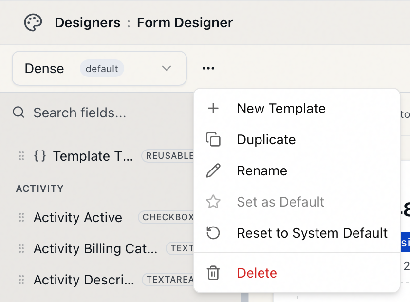
- New Template — create a fresh template, named as you like (names have to be unique for the form type). It starts as a copy of whichever template you have selected, or from Aeon's built-in system layout if none is.
- Duplicate — copy the current template under a new name (pre-filled as "<name> (Copy)").
- Rename — rename the current template.
- Set as Default — make this template the one used when no role-specific layout applies.
- Reset to System Default — discard all customizations in this template and restore Aeon's built-in request layout. Aeon confirms first: "This will overwrite all customizations in this template. This action cannot be undone."
- Delete — remove the template. Aeon confirms that this "will also remove any role assignments that reference this template. This action cannot be undone."
The system-default layout that Reset to System Default restores is defined on the server, not in your browser — so a reset always returns to Aeon's shipped request layout.
If you've edited the layout and try to pick a different template, Aeon warns "You have unsaved changes. Discard and switch templates?" Switching anyway throws away your edits. Save first if you want to keep them.
Adding a field
The most common task is putting a field — often one of your custom fields — onto the form.
- In the field palette on the left, find the field. Browse by category or type in the Search fields... box to filter.
- Drag it onto the card where you want it — or click the field's + to drop it into wherever you're working: select a card (or any field already in that card) first, and the new field lands there. (A card's own + button, "Add field to this card," opens a field picker for that card.)
- The field lands in that card and is selected automatically, so its toolbar appears ready for tweaking.
Aeon still has to put the field somewhere, so it creates a container for it — a new panel called New Panel holding a card called General — and drops the field in there. If that's not where you wanted it, drag it across and remove the empty panel.
A data field can only appear once on the form. Once it's placed, it disappears from the palette; if every field is already on the form you'll see "All fields are already on the form," and a search with no matches shows "No fields match your search."
Your site's custom request fields (defined in Custom Field Definitions) load into the palette under Custom Fields — no extra step.
Template Text — free-form labels and notes
Beyond data fields, the palette includes a Template Text element, pinned at the top and badged reusable — unlike a data field, you can place it as many times as you need. Use it for static or templated text: a heading, an instruction line, or a computed string that mixes in field values.
Drop it like any field, then type its content in place on the canvas — double-click the element, or open its Display template popover and click Edit template…. That popover's Template string box shows what the element is set to ("No template configured" until you give it something), and the Edit template… button is how you change it.
The request header is built from these template-text lines; use Add template text in the header to build the title row.
Editing a field
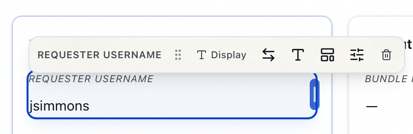
Select a field on the canvas and a small toolbar appears above it. Which controls you get depends on the field's display mode. Every selected field has these four:
- Display mode — how the field behaves, with the current mode shown on the button. Choose Input (staff can edit the value — the normal choice), Read-only (visible but not editable), or Display (rendered as formatted text rather than a form control). Modes a field doesn't allow are grayed out in the menu, and a field whose mode is fixed has no Display mode control at all.
- Swap field — replace this field with a different one, keeping its place on the grid.
- Field options (the sliders button) — the field's layout and label settings:
- Custom label — override the field's default label with your own wording. (For a Template Text element this is labeled Field name.)
- Column span (N/12) — how many of the 12 grid columns the field occupies. A 6-column field sits next to another 6-column field; a 12-column field takes the whole row.
- Row order — the field's vertical position within the card; lower numbers render nearer the top.
- Remove field (the trash button) — take the field off the form. It returns to the palette so you can re-add it.
Two more controls appear only when the field is in Display mode, since they govern how a value is rendered rather than edited:
- Typography — text styling for the field.
- Display template — choose how the value renders: Plain text, Icon + text, Badge + text, Text + button, Separator, Metadata line, or Template string (with an Edit template… option for the templated ones).
The field below is in Display mode, so its toolbar shows all six controls:
You can also set column span directly on the canvas by dragging the field's right edge.
Arranging the layout
-
Move a field, card, or panel by dragging it on the canvas — or, with it selected, press
⌥/Alt+↑or↓to shift it up or down within its container. -
Resize a field by dragging its right edge; a card or panel's width is set from its Layout popover (the columns button: Display title, Column span (N/12), Row order).
-
Rename a card or panel by double-clicking its title on the canvas, or editing its Display title in the Layout popover.
-
Restyle a card or panel from its Styling popover (the palette button).
-
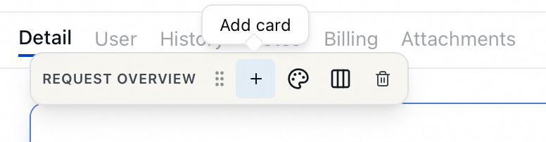
Add a panel with the Add panel button on the canvas; add a card to a panel with that panel's + (Add card) button.
-
Remove a card or panel from the trash button on its toolbar. Aeon confirms — "Remove card?" for a card, "Remove panel?" for a panel — since removing a panel also removes the cards inside it.
Delete/Backspace— remove the selected field.Escape— clear the current selection.⌥/Alt+↑/↓— move the selection up or down.F6/Shift+F6— cycle focus between the palette and the canvas.Ctrl+Z/⌘Z(andShift+Ctrl+Z/⇧⌘Z) — undo and redo.Ctrl+S/⌘S— save the layout.
Press ? anywhere in the designer for this list on screen.
Saving your work
The toolbar's right side always shows the current state — Saved, Unsaved, or Saving....
- Make your changes; the indicator switches to Unsaved.
- Click Save — or press
⌘S/Ctrl+S. The layout is written to the selected template and the indicator returns to Saved. - To throw away changes since your last save, click the discard (circular-arrow) button next to Save.
Because layout edits live only in the browser until you save, leaving the page or switching templates while Unsaved discards them. Save before you move on. The Customization Manager tracks the unsaved state for you and will warn before you lose work.
How layouts reach staff
Saving a template doesn't, by itself, change what a given staff member sees — that depends on role assignments:
- The default template is used for any role that doesn't have its own request-form layout assigned.
- To give a role a specific layout, assign the template to that role's Request Form slot in Editing a Role: Layout Assignments.
This is what lets you maintain, say, a streamlined front-desk request page and a fuller processing page from the same designer.