Card Designer: User Card
Wherever Aeon shows users as a scrollable list — the Users list and the user results in global search — each person is drawn as a compact card. A user card starts with a fixed top line (the username and a status badge) and, below it, shows whatever fields you choose: full name, department, email, expiration date, and so on. The User Card Designer is where you decide what goes on those lines.
You don't need this to run Aeon day to day. Aeon includes a default user card, and most sites leave it alone. You reach for the designer when the default doesn't surface the information your staff scan for — for example, if your front desk needs each user's organization and expiration date at a glance, or you want patron email on the card so staff don't have to open every record.
- The default user card hides a field your staff rely on (for example, you want Organization and Phone visible in the list).
- You want to reorder or restyle what's on the card — bigger name, a muted secondary line, an icon next to the email.
- You're setting up Aeon for a new site and want the user list to match how your reading room identifies people.
The User Card Designer only changes the compact card shown in lists and search results. It doesn't change the full user record you open and edit — that layout is the Form Designer: User Form. Editing a card never changes any user's data; it only changes how users are displayed.
Opening the User Card Designer
- Open the Customization Manager.
- In the Designers category, choose Card Designer.
- Click User Card in the left menu. (The other card types are Request Card, Request Card (Wide), and Activity Card.)
The header reads User Card Designer with the subtitle "Customize how user cards appear in lists."
The Card Designer is part of the Designers configuration area. Your role must have the Designers configuration capability to open and edit it; without it, the Card Designer won't appear in the Customization Manager. See Roles & Capabilities.
How the designer is laid out
The Card Designer has two toolbars across the top and two working areas below them:
- Template toolbar (top) — which template you're editing, the ⋯ template menu, the save-state indicator, and Save.
- Designer toolbar — undo and redo, a Reset to System Default button (the ↺ icon), a Zoom control, and a ? button that opens the keyboard-shortcut list.
| Area | What it does |
|---|---|
| Fields (left) | The palette of fields you can add, grouped into categories (Name, Identity, Contact, Organization, Address, Access, and so on), with a Search fields... box at the top. |
| Card Preview (center) | A live preview of the user card — this is your canvas. Drag fields onto it, click a field to select it, reorder rows, and edit a field's content in place. When you select a field, a small toolbar appears above it with that field's settings. |
A hint line under the preview sums up how you work: "Click a field to edit it in place · Double-click a field to edit its content · Drag to move · Double-click the toolbar label to rename · Click a row's background to reorder or remove the row."
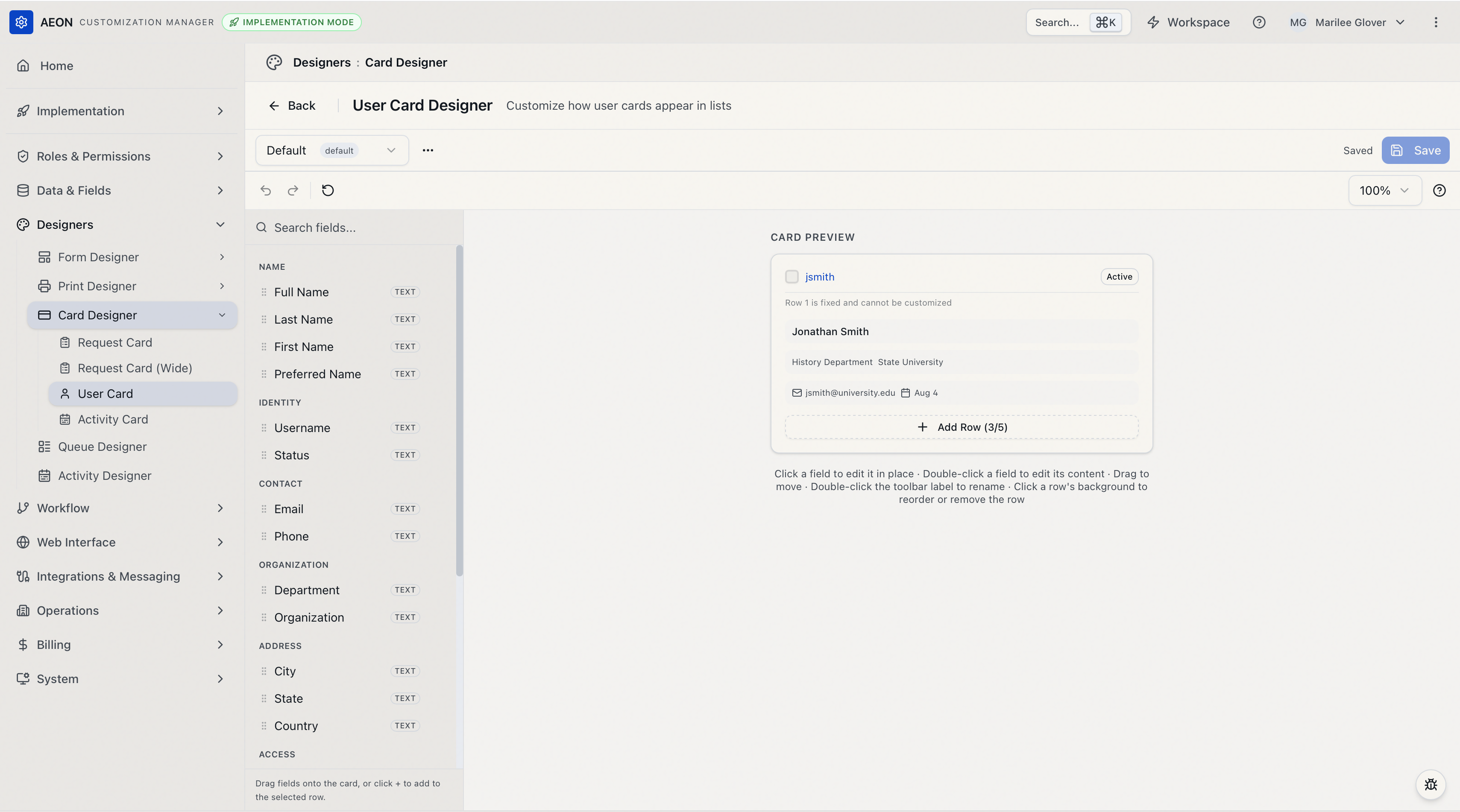
Row 1 is fixed
The first row of every user card is fixed and cannot be customized. It shows the selection checkbox, the user's username, and a status badge (for example, Active). The preview labels this row "Row 1 is fixed and cannot be customized." Everything you design goes in the rows below it — up to 5 rows that you control.
Aeon's built-in user card fills three of those rows: the user's full name, then department and organization together, then email and expiration date — the last two with icons. That's the starting point you're editing, and it's what Reset to System Default returns you to.
Building the card
Add a field
You can add a field two ways:
- Drag it. Grab a field from the Fields palette and drop it onto a row in the preview (or onto the gap between rows to start a new row).
- Click it. Click a field in the palette and it's added to the row of whatever field is currently selected — or to the last row if nothing is selected.
Browse by category — Name, Identity, Contact, Organization, Address, Access, Custom Fields, Special — or type in the Search fields... box to filter. A field can only appear once; once it's placed, it leaves the palette.
Any user custom fields you've defined show up under the Custom Fields category, so you can put site-specific user data on the card alongside the built-in fields. See Custom Field Definitions.
Add or remove a row
- To add a row, click Add Row at the bottom of the card preview. The button shows how many rows you've used (for example, Add Row (3/5)). It disappears once you reach the five-row limit.
- To remove a row, click the row's empty background to select the whole row, then use its Remove row control. You can't remove the last remaining customizable row.
Reorder fields and rows
- Move a field within or between rows: drag it to the new spot. You can also select a field and press
⌘/Ctrl+↑or⌘/Ctrl+↓to move it to the row above or below. - Reorder whole rows: click a row's empty background to select it, then drag it to a new position.
Delete a field
Select the field and either press Delete / Backspace, or click the Remove field (trash) button on its floating toolbar.
⌘/Ctrl+↑/↓— move the selected field to the row above or below.⌘D/Ctrl+D— duplicate the selected field.Delete/Backspace— remove the selected field, or the selected row.Escape— clear the selection.F6/Shift+F6— cycle focus between the palette and the preview.⌘Z/Ctrl+Z(and⇧⌘Z/Ctrl+Shift+Z) — undo and redo.⌘S/Ctrl+S— save the layout.
Press ? anywhere in the designer for this list on screen.
Styling a field
Select a field in the preview to bring up its floating toolbar. From left to right it gives you:
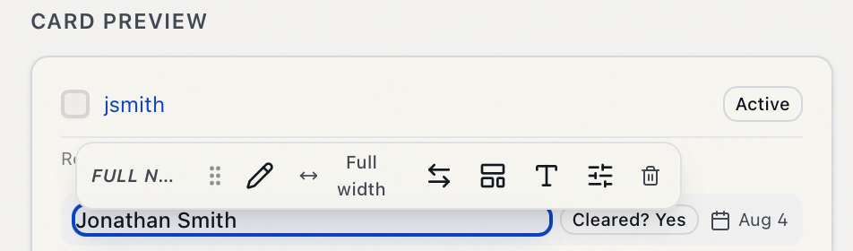
- Edit content (the pencil) — compose what the field says. You can also double-click the field in the preview to jump straight into editing its content.
- Width — how much horizontal space the field takes: Auto, Fill, 1/3, 1/2, 2/3, or Full width. The button shows the current setting, so you can see a field's width without opening the menu.
- Swap field — replace this field with a different one from a searchable picker, keeping its place. A Template Text element has no Swap control, since its content is free-form rather than bound to a field.
- Display style — how the value is rendered:
- Plain Text — just the value.
- Icon + Text — the value with a small icon (reveals an Icon picker — for example, a mail icon next to the email).
- Badge — the value in a pill (reveals a Badge style: Default, Outline, Secondary, Destructive).
- Template — a free-form string mixing static text with field placeholders (reveals a Template string box; write something like
{firstName} {lastName}, wrapping field names in{ }).
- Typography — Text Size (Extra Small / Small / Medium), Font Weight (Normal / Medium / Semibold / Bold), and Color (Default / Muted / Primary / Accent).
- Field options — a Custom Label (override the field's name; leave blank for the default — or double-click the field's label in the toolbar to rename it inline) and Hide if Empty (on by default — the field drops off the card when the user has no value for it, so cards stay tidy).
- Remove field (the trash) — take the field off the card.
Leave Hide if Empty on for optional fields like phone or organization. A user with no phone number simply won't show that line, instead of leaving an empty gap — so your list stays tight and shows only real data.
A worked example
Say you want each user card to read: full name in bold, then department and organization on one muted line, then email with a mail icon.
- Add Full Name (Name category). On its toolbar, open Typography and set Font Weight to Bold; set Width to Full width.
- Add Department and Organization (Organization category) into the next row, both at Auto width and Muted color (Typography).
- Add Email (Contact category) into a third row. Set its Display style to Icon + Text and pick a mail icon. Leave Hide if Empty on.
- Watch the center preview update as you go. When it looks right, Save.
Templates: saving and reusing layouts
A card layout is stored as a template. The template toolbar at the very top lets you keep more than one and choose which is in effect.
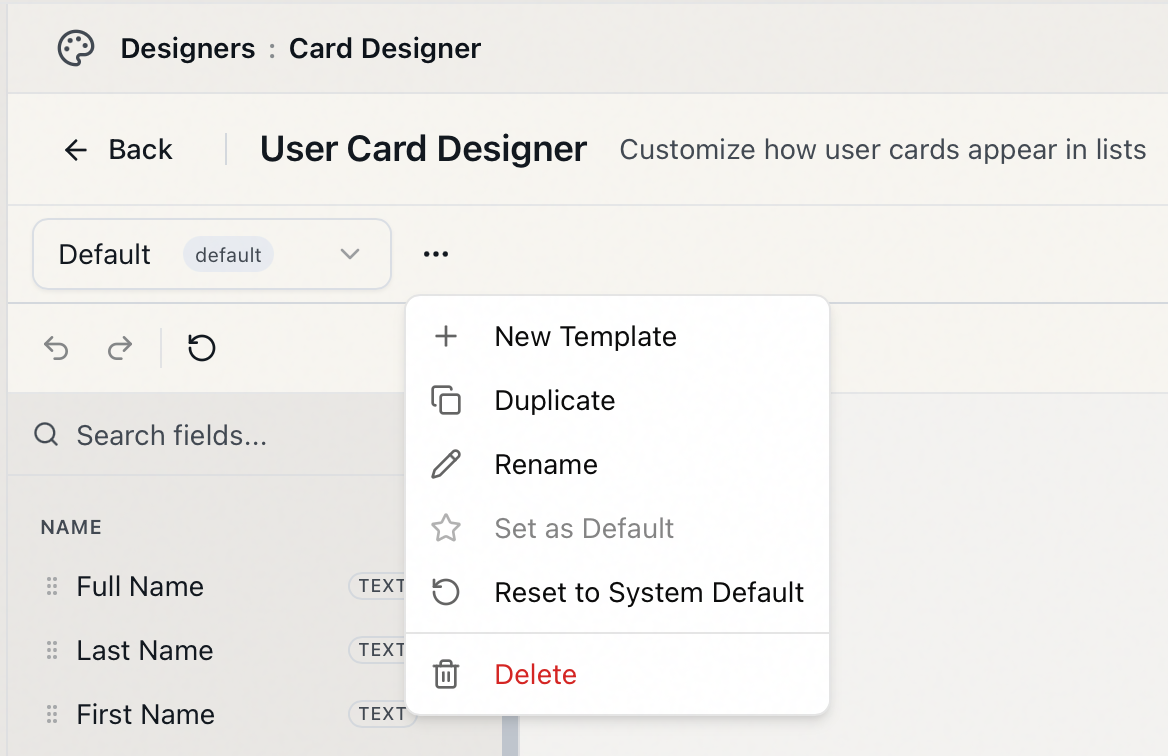
- Switch templates: use the template dropdown on the left of the toolbar. The one marked default is the layout staff see unless a role is assigned a different one (see below).
- New Template: from the ⋯ menu, choose New Template and name it — names have to be unique for the card type. It's created from the template you currently have open, or from Aeon's built-in system layout if none is.
- Duplicate / Rename: also in the ⋯ menu.
- Set as Default: ⋯ → Set as Default makes the selected template the one used when no role-specific layout applies.
- Reset to System Default: removes all customizations in the selected template and restores Aeon's built-in user card. You can trigger it two ways — ⋯ → Reset to System Default, or the ↺ button on the designer toolbar. Aeon confirms first (from the menu, "…overwrite all customizations in this template. This action cannot be undone."), and the reset can't be undone.
- Delete: ⋯ → Delete removes the template. Aeon confirms, and notes that deleting also removes any role assignments that reference it (those roles fall back to the default).
Your changes are not saved automatically. The template toolbar shows Unsaved while you have pending edits and Saved once they're written. Click Save (or press ⌘S / Ctrl+S) to commit. While you have unsaved edits, a Discard changes button (a ↺ icon next to Save) appears; click it to throw away those pending edits and snap back to the last saved version. Undo / Redo (⌘Z / ⇧⌘Z) step through your edits.
If you click Back or switch templates with unsaved edits, Aeon warns you first (an Unsaved Changes dialog, or "You have unsaved changes. Discard and switch templates?") so you don't lose work.
The designer has two ↺ buttons that do different things. Discard changes (next to Save on the template toolbar, and only there while you have unsaved edits) just rolls back to the last saved version. Reset to System Default (the ↺ on the designer toolbar, and in the ⋯ menu) goes further — it replaces the template's saved layout with Aeon's built-in default and can't be undone.
Assigning a card layout to a role
Setting a template as Default affects everyone. If you instead want a particular role to see a specific user card, assign the template in the Role Editor rather than here.
In the Role Editor, open the Layouts tab, find User Card under the Cards group, and pick the template for that role. Leaving it unset means that role uses whichever template is set as the system default. See Editing a Role: Layout Assignments.
The card preview uses representative sample data, so you can design the layout without opening a real record. Once you save and the layout is in effect, open the Users list (or search for a user) to see your cards rendering with real people.