Card Designer: Request Card (Wide)
A request appears as a compact card wherever it's listed. In a queue's split-view the card has limited horizontal room, so it stacks its information vertically. But Aeon also lists requests in places with much more horizontal room — the Requests tab on a user record, an activity's requests, a bundle, or an appointment. In those embedded lists Aeon uses a wide version of the request card that spreads its fields across the row instead of stacking them.
The Request Card (Wide) designer is where you control that wide layout. It's the same drag-and-drop tool as the standard Card Designer: Request Card — the difference is which layout it edits and where that layout shows up. Most sites set the wide card up once, alongside the Request Card, so requests look consistent throughout the app.
- You've customized the Request Card and want the embedded lists (user, activity, bundle, appointment) to match.
- A request looks cramped or sparse when it appears on a user record or activity, and you want to add or remove fields for that wider context.
- You want a specific queue's wide cards to surface a different field — for example, the requested format or a custom field.
The Request Card and the Request Card (Wide) are stored and edited independently — changing one does not change the other. They share the same field palette and the same designer controls, so once you've used one, the other is familiar. If you want them to match, set both up.
Where the wide card appears
The layout you build here renders wherever requests are listed in a wide container:
- The Requests tab on a user record.
- The requests list on an activity.
- Requests grouped into a bundle.
- Requests tied to an appointment.
The queue list uses the Request Card instead.
Opening the designer
- Open the Customization Manager.
- In the Designers category, choose Card Designer.
- Click Request Card (Wide) in the left menu. (The other card types are Request Card, User Card, and Activity Card.)
The header reads Card Designer with the subtitle "Customize how request cards appear in embedded lists (user, activity, bundle, appointment)."
The Card Designer is part of the Designers configuration area. Your role must have the Designers configuration capability to open and edit it; without it, the Card Designer won't appear in the Customization Manager. See Roles & Capabilities.
How the designer is laid out
The Card Designer has two toolbars across the top and two working areas below them:
- Template toolbar (top) — which template you're editing, the ⋯ template menu, and Save.
- Designer toolbar — the per-queue Layout: selector, a Reset to System Default button (the ↺ icon), and undo / redo.
| Area | What it does |
|---|---|
| Fields (left) | The palette of fields you can add, grouped into categories (Item, Location, Dates, User, and so on), with a Search fields... box at the top. |
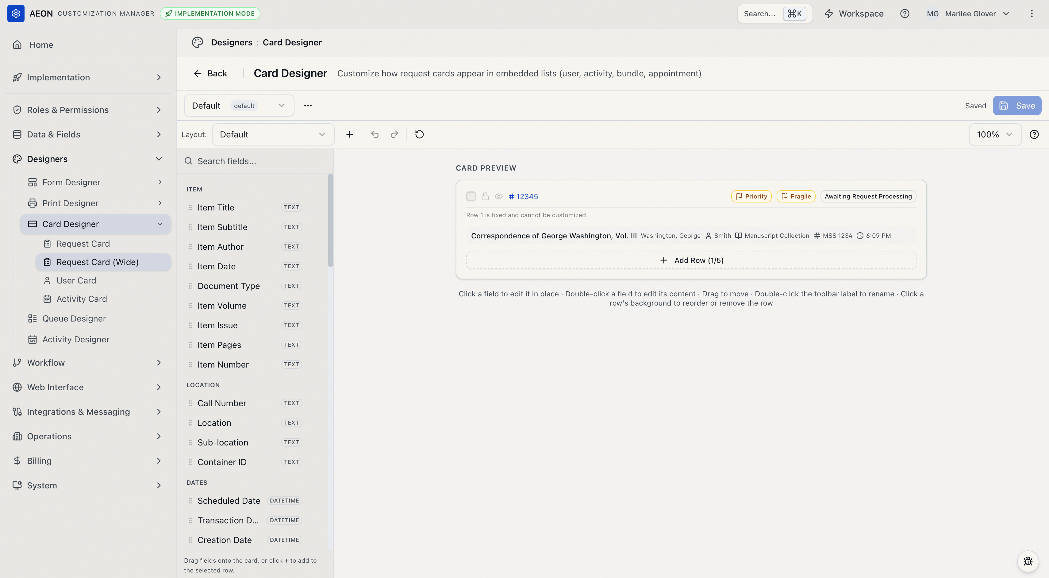
| Card Preview (center) | A live preview of the wide card — this is your canvas. Drag fields onto it, click a field to select it, reorder rows, and edit a field's content in place. When you select a field, a small toolbar appears above it with that field's settings. |
Row 1 is fixed
The first row of every request card is fixed and cannot be customized. On the wide card it shows the selection checkbox, the lock and view (eye) icons, the transaction number, the request's flags, and the status badge. The preview labels this row "Row 1 is fixed and cannot be customized." Everything you design goes in the rows below it.
The wide card shows a request's flags in this fixed row automatically — there's room for them, so you don't have to place a field. (The Request Card carries a Flags field in its configurable rows instead.) The Flags element is also in the palette under Special for both cards, so you can place flags in your own rows too.
The default wide layout
Out of the box the wide card uses a single row that lays the item title, author, requester, document type, call number, and scheduled date out side by side, taking advantage of the extra width. Below the fixed Row 1, you can build up to 5 rows that you control.
Building a card
Add a field
You can add a field two ways:
- Drag it. Grab a field from the Fields palette and drop it onto a row in the preview (or onto the gap between rows to start a new row).
- Click it. Click a field in the palette and it's added to the row of whatever field is currently selected — or to the last row if nothing is selected.
Browse by category or type in the Search fields... box to filter. A field can only appear once; once it's placed, it leaves the palette.
Add or remove a row
- To add a row, click Add Row at the bottom of the card preview. The button shows how many rows you've used (for example, Add Row (1/5)). It disappears once you reach the five-row limit.
- To remove a row, click the row's empty background to select the whole row, then use its Remove row control. You can't remove the last remaining customizable row.
Reorder fields and rows
- Move a field within or between rows: drag it to the new spot. You can also select a field and press Ctrl/Cmd + ↑ or Ctrl/Cmd + ↓ to move it to the row above or below.
- Reorder whole rows: click a row's empty background to select it, then drag it to a new position.
- Keyboard: in the preview, press Space to grab the selected item, the arrow keys to move it, and Space again to drop. Press Escape to deselect.
Delete a field
Select the field and either press Delete / Backspace, or click the Remove field (trash) button on its floating toolbar.
Styling a field
Select a field in the preview to bring up its floating toolbar. From left to right it gives you:
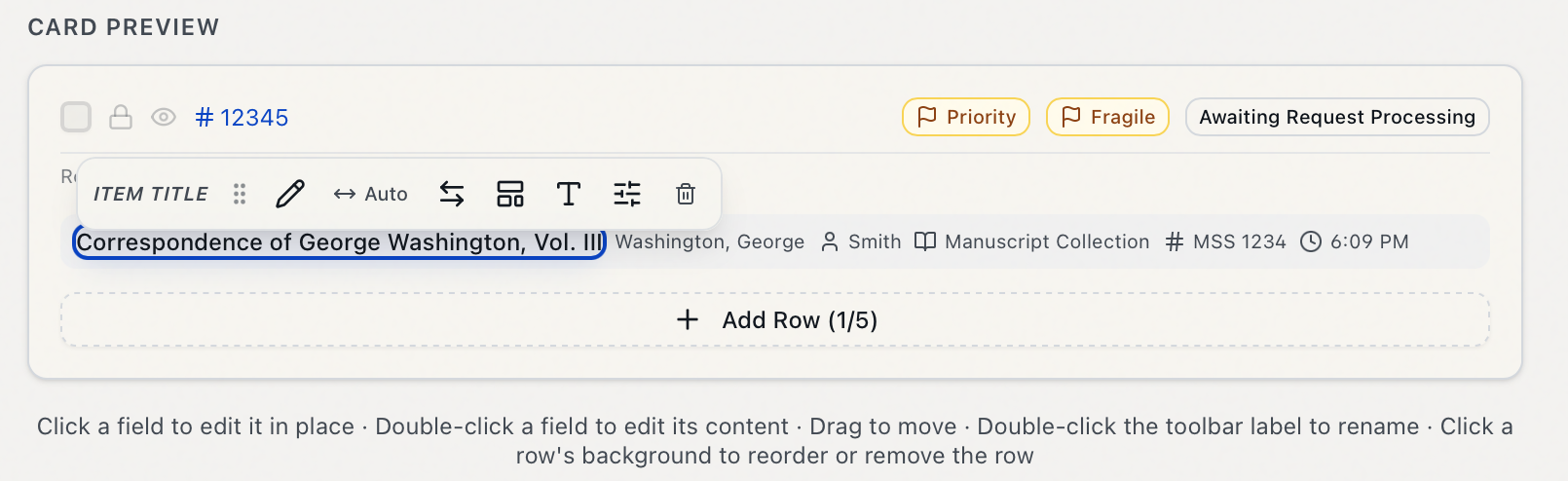
- Edit content (the pencil) — compose what the field says. You can also double-click the field in the preview to jump straight into editing its content.
- Width — how much horizontal space the field takes: Auto, Fill, 1/3, 1/2, 2/3, or Full width.
- Swap field — replace this field with a different one from a searchable picker, keeping its place.
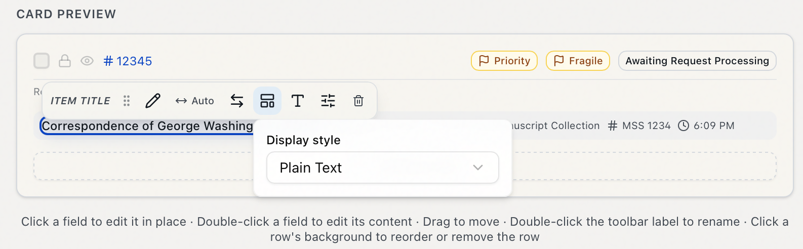
- Display style — how the value is rendered:
- Plain Text — just the value.
- Icon + Text — the value with a small icon (reveals an Icon picker).
- Badge — the value in a pill (reveals a Badge style: Default, Outline, Secondary, Destructive).
- Template — a free-form string mixing static text with field placeholders (reveals a Template string box; write something like
{itemTitle} by {itemAuthor}, wrapping field names in{ }).
- Typography — Text Size (Extra Small / Small / Medium), Font Weight (Normal / Medium / Semibold / Bold), and Color (Default / Muted / Primary / Accent).
- Field options — a Custom Label (override the field's name; leave blank for the default — or double-click the field's label in the toolbar to rename it inline) and Hide if Empty (on by default — the field drops off the card when the request has no value for it, so cards stay tidy).
- Remove field (the trash) — take the field off the card.
The palette includes fields from the linked records too. Alongside Item, Location, Dates, Service, Identifiers, and request Custom Fields (Item Info 1–5), you'll find a User group (researcher name, department, email), an Appointment group, and an Activity group — so a card can surface the requester's name or their appointment time, not just the bibliographic data. The Special group includes the Flags element and a reusable Template Text element.
Showing a different card for one queue
By default, every queue's embedded lists use the same wide card — the Default layout. You can override that for individual queues.
The Layout: selector in the designer toolbar controls which layout you're editing. It starts on Default.
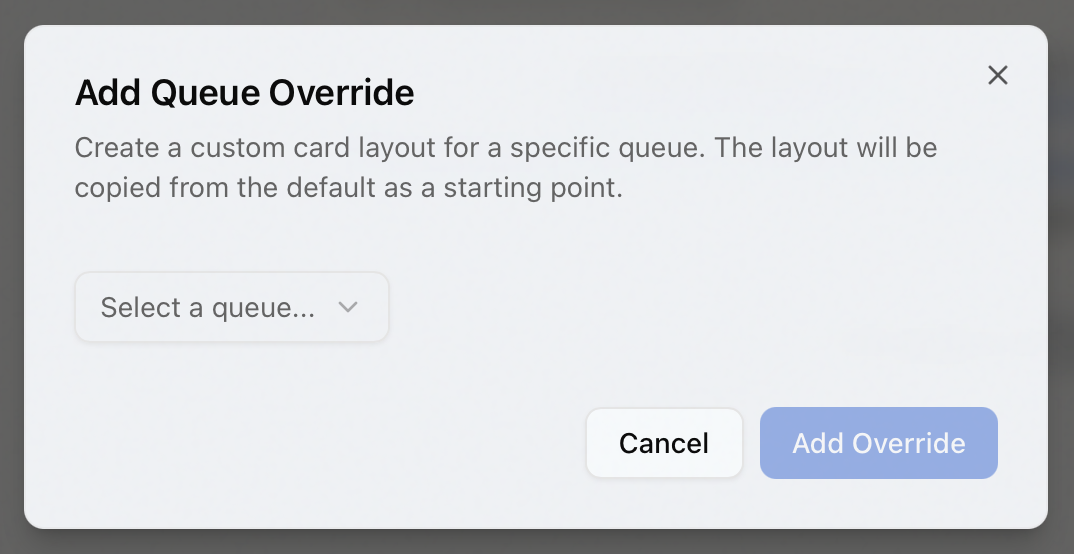
- Click the + button next to the Layout selector (its tooltip reads "Add queue override").
- In the Add Queue Override dialog, pick the queue from the dropdown and click Add Override. The new layout starts as a copy of the Default, so you're never building from scratch.
- The Layout: selector switches to that queue. Edit it just like the default — your changes now apply only to that queue's wide cards.
- To go back to editing the shared layout, switch the Layout: selector to Default.
To remove a queue's custom layout, select it in the Layout: selector and click the trash icon ("Remove this override"). Aeon asks you to confirm with a Remove Override? dialog; click Remove Override and that queue returns to using the Default layout.
Only the Request Card and Request Card (Wide) support per-queue overrides, because requests live in queues. The user and activity card designers don't offer them.
Templates: saving and reusing layouts
A card layout is stored as a template. The template toolbar at the very top lets you keep more than one and choose which is in effect.
- Switch templates: use the template dropdown on the left of the toolbar. The one marked default is the layout staff see.
- New Template: from the ⋯ menu, choose New Template and name it. It's created from the template you currently have open.
- Duplicate / Rename: also in the ⋯ menu.
- Set as Default: ⋯ → Set as Default makes the selected template the one in effect for everyone.
- Reset to System Default: removes all customizations in the selected template and restores Aeon's built-in wide layout. You can trigger it two ways — ⋯ → Reset to System Default, or the ↺ button on the designer toolbar — and either way Aeon confirms first ("Reset Layout?"). This can't be undone.
- Delete: ⋯ → Delete removes the template. Aeon asks you to confirm first.
Your changes are not saved automatically. The template toolbar shows Unsaved while you have pending edits and Saved once they're written. Click Save (or press Ctrl/Cmd + S) to commit. While you have unsaved edits, a Discard changes button (a ↺ icon next to Save) appears; click it to throw away those pending edits and revert to the last saved version.
If you try to leave the Card Designer — or switch templates — with unsaved edits, Aeon warns you first ("You have unsaved changes…") so you don't lose work.
The designer has two ↺ buttons that do different things. Discard changes (next to Save on the template toolbar, and only there while you have unsaved edits) just rolls back to the last saved version. Reset to System Default (the ↺ on the designer toolbar, and in the ⋯ menu) goes further — it replaces the template's saved layout with Aeon's built-in default and can't be undone.
Undo and redo
The designer toolbar has Undo (Ctrl/Cmd + Z) and Redo (Ctrl/Cmd + Shift + Z, or Ctrl/Cmd + Y) for stepping back and forth through your edits before you save.
Which template staff see
The wide card everyone sees is the one marked default — set it with ⋯ → Set as Default. Unlike the Request Card, the Request Card (Wide) isn't assigned per role: the Role Editor's Layouts tab has Cards slots for the Request Card, User Card, and Activity Card, but not the wide card. So the wide card's default template applies to every role.
The card preview uses representative sample data, so you can design the layout without opening a real request. Once you save and the layout is in effect, open a user record's Requests tab (or an activity, bundle, or appointment) to see your wide cards rendering with real requests.